The color of a product may appear different depending on lighting conditions, the environment in which it is placed, and even the screen used to view the images.
Color differences between product photos and lifestyle photos
To have a reference that is as faithful as possible to the actual color of the product, we recommend consulting the images on a white background. These photographs are taken under controlled lighting conditions and allow the product's color to be represented as accurately as possible.
For example, this would be the accurate photo of a graphite-colored chair:
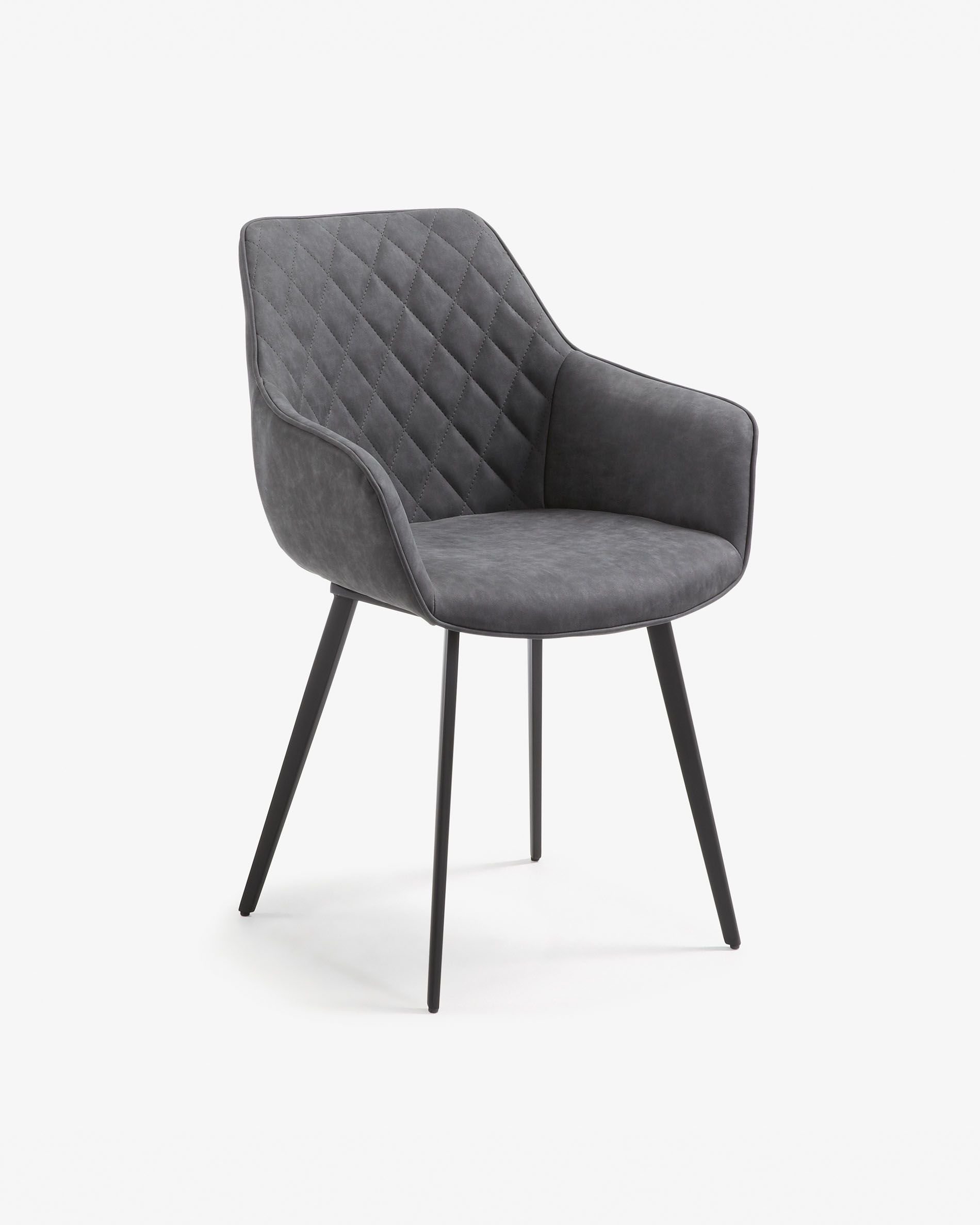
On the other hand, lifestyle photos may present differences compared to the photo with a white background because color is always perceived according to the light that surrounds it. Depending on the type of lighting and its tone, the same finish may look warmer, lighter, darker, or slightly yellowish.
Depending on the tone of the light it is exposed to:
With indirect natural light, a product can show a color that is more balanced and faithful to the original. The tone appears soft, with less contrast. The shadows are diffused and the nuances look more uniform.
With direct sunlight, colors usually look more intense and contrasted. There may be very bright areas and hard shadows. Some tones may appear warmer or slightly desaturated due to the intensity of the light.
With indoor lighting, the tone depends a lot on the type of light bulb, but there is usually less natural variation than with daylight.
With a direct spotlight in a nighttime setting, a very high contrast is generated. The tone of the object can be altered significantly depending on the angle and the temperature of the light. The illuminated areas may look very bright, while the rest remains in deep shadow.
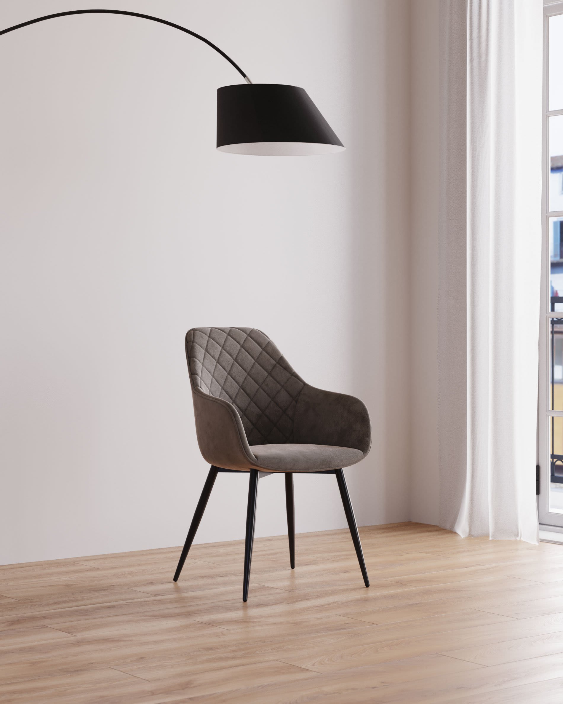
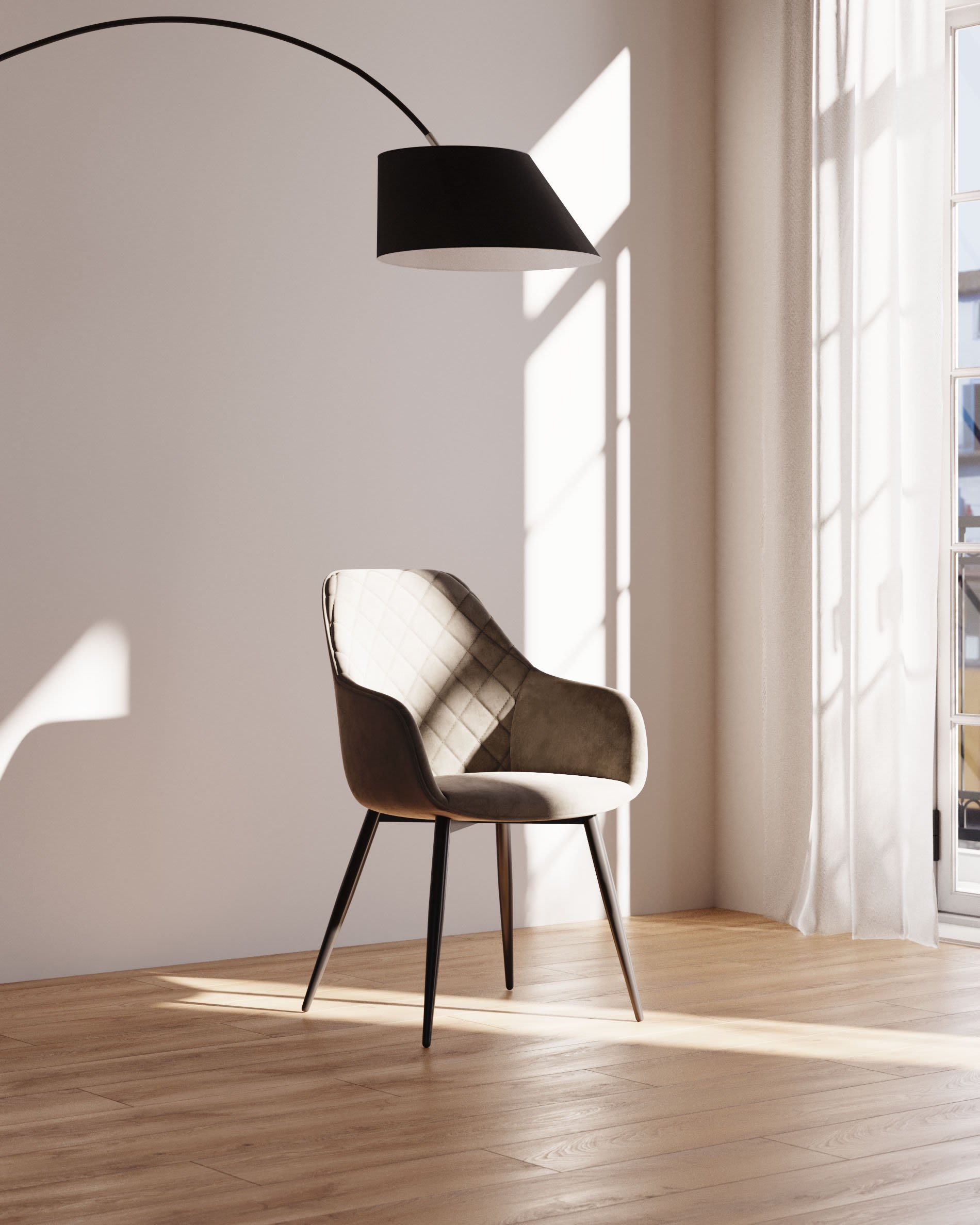
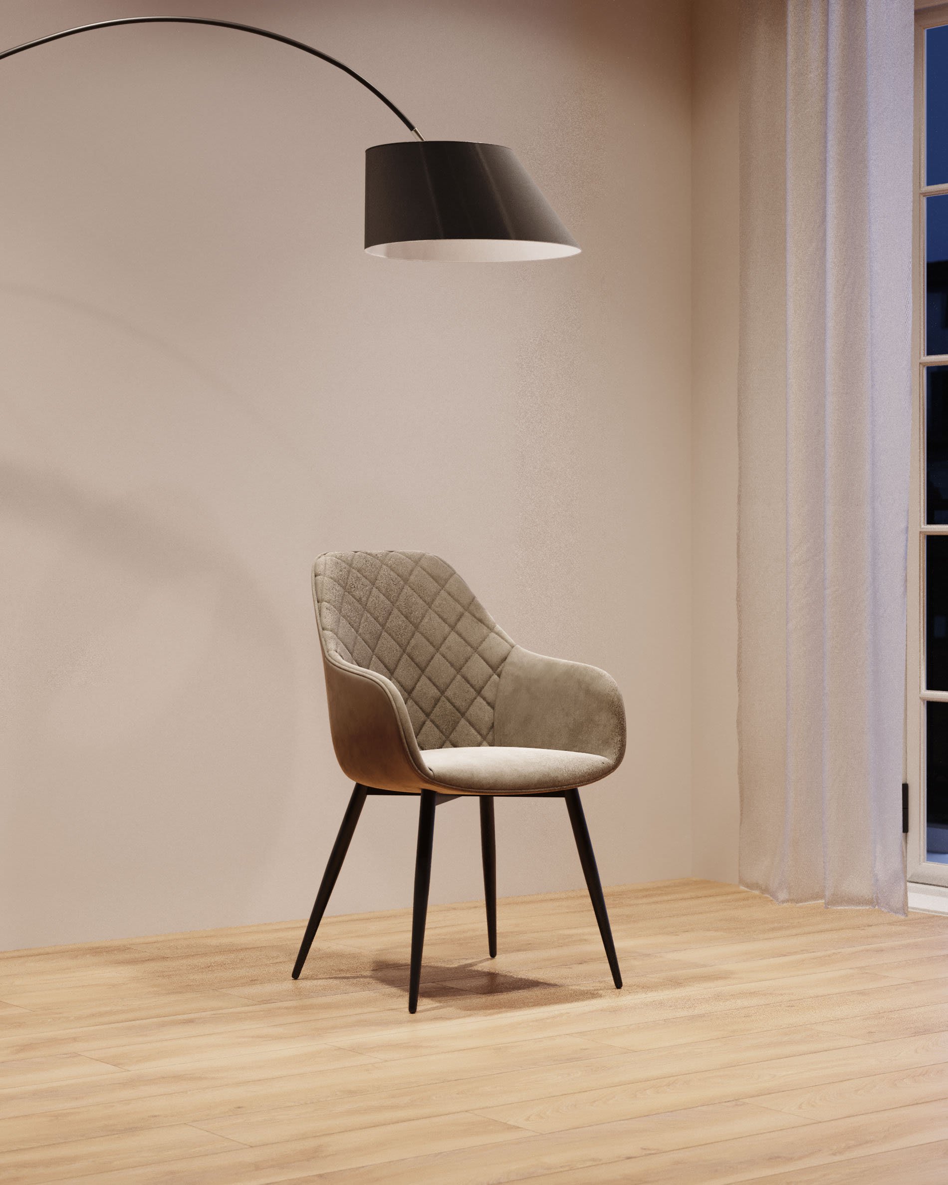
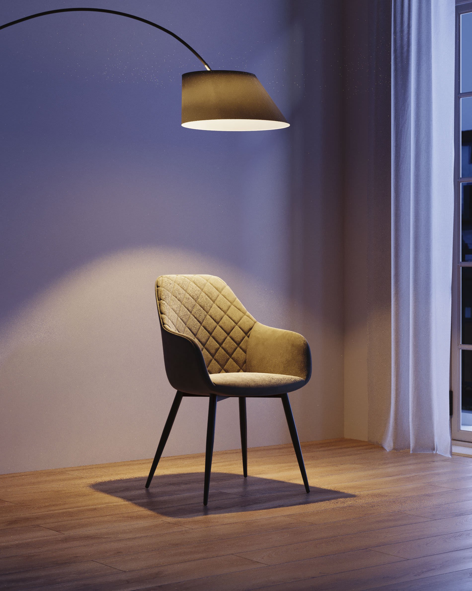
Indirect natural light Direct sunlight Indoor lightning Direct spotlight
What is color temperature?
Color temperature is the tone of the light and can also influence the appearance of the product. It can be warmer, more neutral, or cooler, and it is measured in degrees Kelvin (K).
Lights with fewer degrees Kelvin offer warmer, yellowish, or orange tones.
Lights with more degrees Kelvin are perceived as whiter, bluish, grayish, or cooler.
In our case, product photos on a white background are taken with neutral 5,200 K light, a temperature very close to that of direct sunlight.
Color temperature scale

Which image best represents the real color?
The same product may look slightly different depending on the lighting and the environment in which it is placed. Therefore, to obtain a reference that is as faithful as possible to the actual color of the product, we recommend using the photographs on a white background as a reference. Please keep in mind, however, that color display may also vary depending on the settings and calibration of the device screen being used.